Display changes
-
Hi everyone, I've made a few changes to the forum display. Here's the current custom css:
.stats-votes {
    display: none;
}

.topic .posts.timeline .timeline-event:not(:first-child), .topic .posts.timeline>[component=post]:not(:first-child) {
    padding-top: 0px;
}
.topic .posts.timeline .timeline-event:not(:last-child), .topic .posts.timeline>[component=post]:not(:last-child) {
    padding-bottom: 0px;
}

.post-signature img {
    display: none;
}

.topic {
    max-width: 800px;
    margin-left: auto;
    margin-right: auto;
}
If people have feedback on this, would like me to make additional changes, or would like me to revert back to default, this is the place to let your voice be heard.
-
@brad I think the width should stay as wide as it was, but the text made a tad bigger. It's disorienting when the width changes during navigation into a thread. Or at the very least, have the width be the same for indexes and threads but make it just a little narrower (larger than 800px though).
-
@pilky Sorry I kind of like it limited width for forum threads for readability. The wideness is OK for the list of topics because the lines aren't as long. Do you have a proposal for a larger maximum width?
-
Any plans to add a theme that has a not so jarring background colour? Sepia is my personal favourite! Otherwise I think the current changes are minimal but I like the aesthetic

-
Hello. I have added a custom background color that may remind you of a classy British periodical (this is purely coincidental if so and not copyright infringing in any way). Please provide feedback on whether you love it, or really love it.
-
@brad I have a profound love for it!
-
@Smitty That's what I'm talking about!
-
@brad 100% agree, less width reads much better
Ray Peat also used 2 columns for his news letters, much easier to read!
-
Why is the background stuck with a light beige color? The darker skins don't work anymore and only makes the text unreadable.
-
I think it looks great.
-
I would favor off-white tones (such as #f5f5f5) for background, if any (to leave it simple and avoid wrapping of images). Yellow tones make the website mellow and bioanergetic.
Those newspapers that you used as reference were probably not printed in such tone, but white or gray and black.
-
@Svet This should be fixed now. I'm now only overriding the cerulean theme.
-
@Amazoniac If you claim one of the skins and give me custom css I can add something for you.
-
Hi, Brad. Thanks for the offer.
I mentioned because the sepia changes were applied to the default theme and I think that it has room for improvement. In case you remain open to suggestions, here they are:
The browned paper is from oxidized cellulose (and you can even have something akin to age-pigment). Since this degradation of paper tends to be worse at the extremities, why not preserve the newspaper aspect inside and darken only the borders?
.skin-cerulean
{
	--bs-body-bg: #f7f7f7;
	box-shadow: 0 0 48px #c3bcb5 inset;

	or (as below)..
	box-shadow: 0 0 48px rgba(0, 0, 0, 0.2) inset;
}

.skin-cerulean .topic
{
	--bs-body-bg: #f7f7f7;
}

.skin-cerulean .navbar.bg-light
{
	background-color: #f7f7f7;
	box-shadow: 0 1px 4px rgba(0, 0, 0, 0.2);
}

blockquote
{
	box-shadow: 0 0 8px rgba(0, 0, 0, 0.2);
	margin-left: 8px;
	margin-right: 8px;
}

.img-fluid [?]
{
	box-shadow: 0 0 8px rgba(0, 0, 0, 0.2);
	margin-left: 8px;
	margin-right: 8px;
}
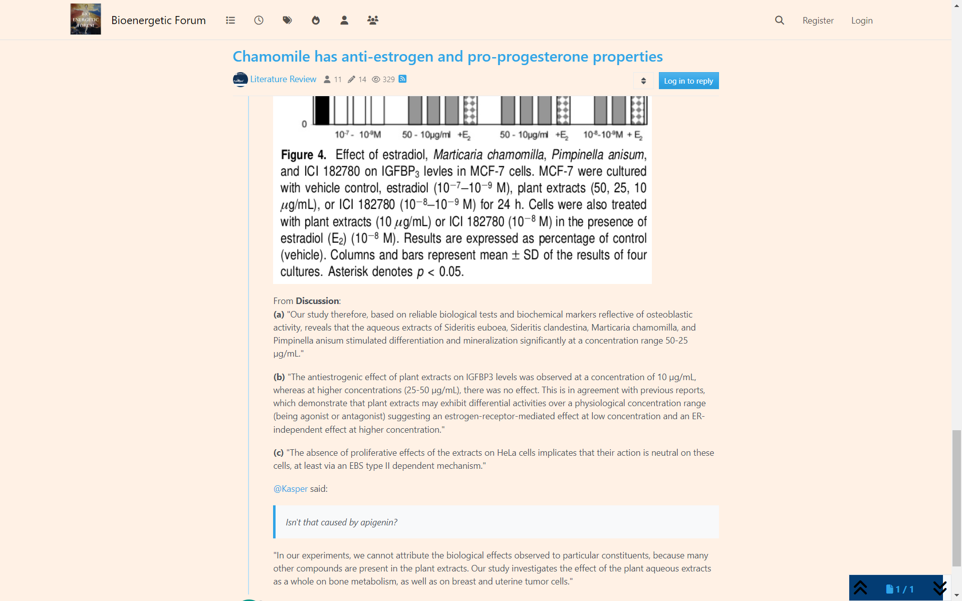
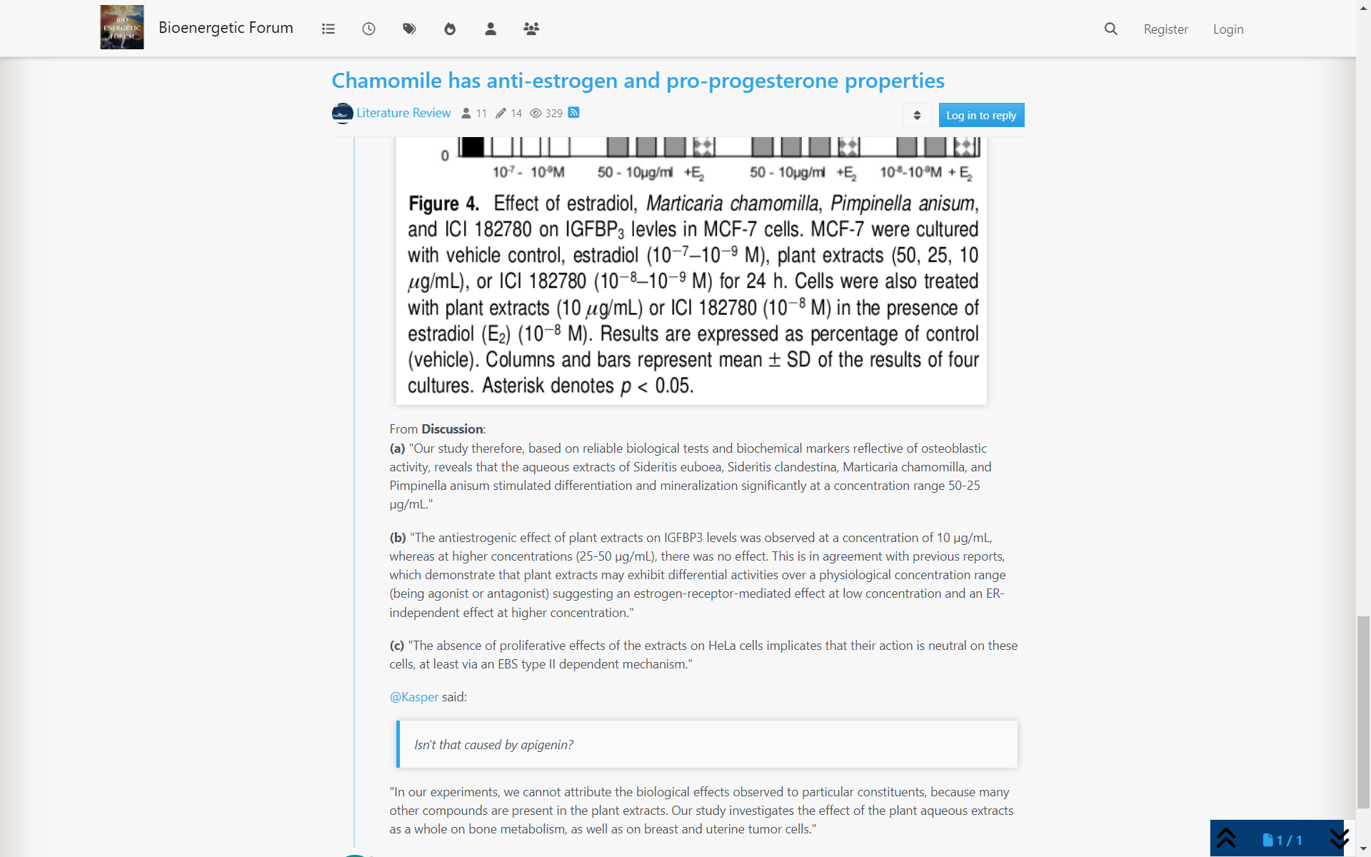
Current:

Suggested:

-
Is there a way in the settings we can customize for the font size to be a little bigger? Finding the font a little hard to read at its current size.
-
@Ixionereus You can usually change that on your browser. I might up the font size a tad as well.
-
@Amazoniac Sorry for just seeing this. I've added a few of your changes, thanks for all of your suggestions. Here's the current css:
.stats-votes { display: none; } .topic .posts.timeline .timeline-event:not(:first-child), .topic .posts.timeline>[component=post]:not(:first-child) { padding-top: 0px; } .topic .posts.timeline .timeline-event:not(:last-child), .topic .posts.timeline>[component=post]:not(:last-child) { padding-bottom: 0px; } .post-signature img { display: none; } .topic { max-width: 800px; margin-left: auto; margin-right: auto; } .ad { padding-left: 20px; margin-left: auto; margin-right: auto; background-color: #0076a7; color: #FFF; } .ad p { margin:0; } .ad a { color: #f18201; font-weight: bold; } .ad a:hover { color: #f19a01; } html { --panel-offset: 64px !important; } .topic .post-tools a { padding: 0.25em 0.75em 0.5em; } .topic .moderator-tools > a { padding: 0.25em 1em 0.75em 0.5em; } .skin-cerulean { --bs-body-bg: #fff1e5; --bs-light: #fff1e5; .topic-list-header { background-color: #fff1e5; } .topic-header { background-color: #fff1e5; } .topic { background-color: #fff1e5; } .navbar.bg-light { background-image: none !important; background-color: #fff1e5 !important; box-shadow: 0 0 2px rgba(0, 0, 0, 0.2); } .topic .posts.timeline .timeline-event .icon .avatar, .topic .posts.timeline .timeline-event .timeline-badge, .topic .posts.timeline>[component=post] .icon .avatar, .topic .posts.timeline>[component=post] .timeline-badge { box-shadow: 0 0 0 0.5rem #fff1e5; } blockquote { box-shadow: 0 0 8px rgba(0, 0, 0, 0.2); margin-left: 8px; margin-right: 8px; } .img-fluid { box-shadow: 0 0 8px rgba(0, 0, 0, 0.2); margin-left: 8px; margin-right: 8px; } } span.d-inline-flex.gap-2.align-items-center { display: none !important; } -
@brad If it could be raised a little, that would be fantastic. Even a small increase would have a significant impact on me as I have mild dyslexia.
Thanks for all your hard work on this forum, really enjoying it.
-
@Ixionereus Alright, I made it a little bit bigger. If you need it larger give this a try.
-
@brad Better now. Thank you!
-
 B brad referenced this topic on
Hello! It looks like you're interested in this conversation, but you don't have an account yet.
Getting fed up of having to scroll through the same posts each visit? When you register for an account, you'll always come back to exactly where you were before, and choose to be notified of new replies (either via email, or push notification). You'll also be able to save bookmarks and upvote posts to show your appreciation to other community members.
With your input, this post could be even better 💗
Register Login