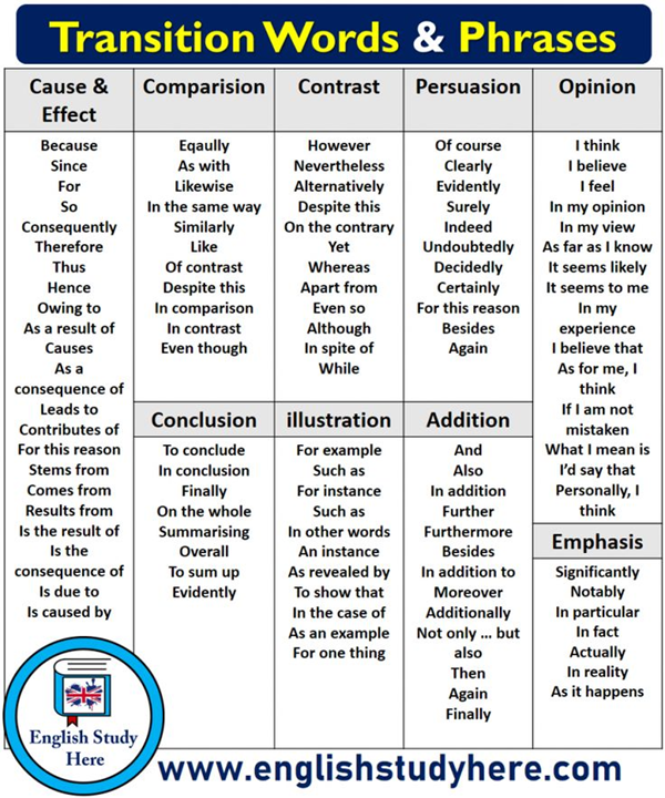
Resources for authors
-
Thank you so very much!
-
Extremely useful compilation of resources. Thank you, @Amazoniac. Glad to see you back in full swing.
-
@Amazoniac If I'm not using pencil and paper, I write using the simple notepad that came installed on my android phone. Or sometimes a typewriter for artistic effect.
-
@jwayne
People usually lean forward to write: talk about being inclined versus disinclined. Assuming that you don't write on your ceiling, looking down must promote focus on the task, as it tends to isolate you from the surroundings. The head angle change might also have minor effects on circulation that can be significant over a long period, but I never stumbled upon any information on this. Perhaps spacecraft designers have considered this aspect because they have to decide what to prioritize on interfaces and the consequences of placing displays on relegated spots.
Might interest you:
- The Pen Is Mightier Than the Keyboard: Advantages of Longhand Over Laptop Note Taking
- Don’t Ditch the Laptop Just Yet: A Direct Replication of Mueller and Oppenheimer’s (2014) Study 1 Plus Mini Meta-Analyses Across Similar Studies
- Is typewriting more resources‑demanding than handwriting in undergraduate students?
- The effect of note-taking modality on offloading and memory under cognitive load
-
Two months of sustained routine to form a habit is the median time:
How are habits formed: Modelling habit formation in the real world
"
Table 2shows the values for the curve parameters for the 39 participants for whom the model was a good fit, andFigure 3shows examples of the modelled curves of their data. Ten of these participants were performing eating behaviours, 15 drinking behaviours and 13 exercise behaviours. The median time to reach 95% of asymptote was 66 days, with a range from 18 to 254 days."
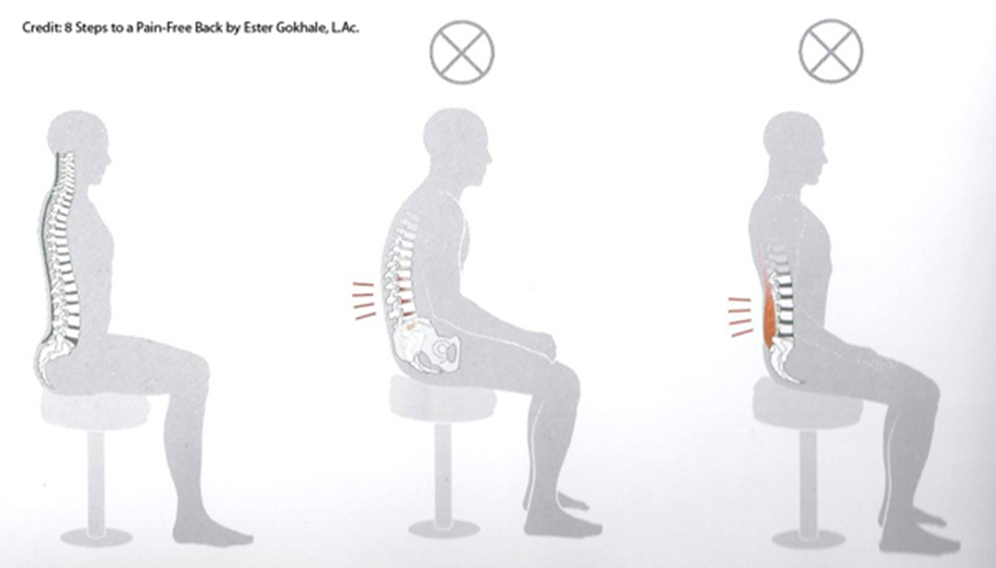
Racing chairs race you to the orthopedist:

For people who read a script while looking at the camera, an alternative would be to disappear from the scene to give space to supportive content on the screen, but appear at the beginning to greet and end to conclude if you want to keep it personal.
Narration may be viewed as a means to invite your victims next to you to show them your perspective rather than confronting them to defend your ideas.

-
This is a nice resource. I wonder how you got them all together @Amazoniac. Surely, you put a lot of time into this. Just looking at them is already overwhelming.
Are you using some of these tools yourself?
What I noticed with you as compared with the past at RPF is that your English is much more understandable now, as I had difficulty understanding you given that English is not your first language and you are Dutch, at least in citizenship if not by blood.
Then again, this is just me being curious and I hope you don't take offense. Or maybe you have a girlfriend now and you have plenty more practice with English. Just saying there are many ways to skin a cat lol.
Whatever your means to improve your English and getting across your ideas in English, it is working very well. I would not rule out you're getting some help from AI, if only to translate Dutch to English better.
But back to writing better, I was wondering if being a good author is something that can come naturally, just like learning a new language where being exposed to good English as in growing up without having to go thru the usual A as in Apple routine of kindergarten. Or even going thru the rigors of diagram analysis in learning sentence construction.
As learning from going to school has its downsides in possibly making the graduates cookie cutter in style.
If one reads a lot and has occasion to write, is it possible that he can develop by osmosis like a sponge from the books and novels of great authors. Like for example if one reads Ray Peat a lot, would one find his writing style becoming more like that of Ray Peat?
I think reading a lot can also do a lot of good in terms of being able to write well. What are your thoughts.
-
I gathered them little by little and the collection was available in a private group where I communicate with my gurus.
The English is better now because of conscious effort to moderate the Prolactinese and keep the speech minimally understandable. However, I continue to reject most of the formalism in everyday writing, for treating it as a conversation and to not depersonalize it too much in trying to eliminate mannerisms. As an example, overuse of adverbs is condemned by writers, but I insist for that rebel quota. I don't bother with correctors for informal writing.
This article relates to the second part of your post. But being on the passenger's seat is different than being the driver, so I don't think that reading a lot will be much effective in improving writing skills, although it helps (enhancing vocabulary would be an example). In support of the need of practice, try to learn a new language by only receiving information and applying it once you reach a satisfactory level: it's likely that you'll struggle.
-
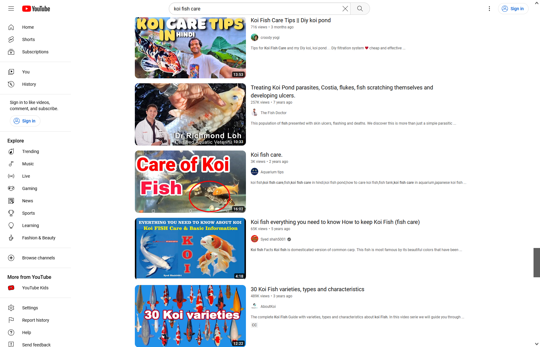
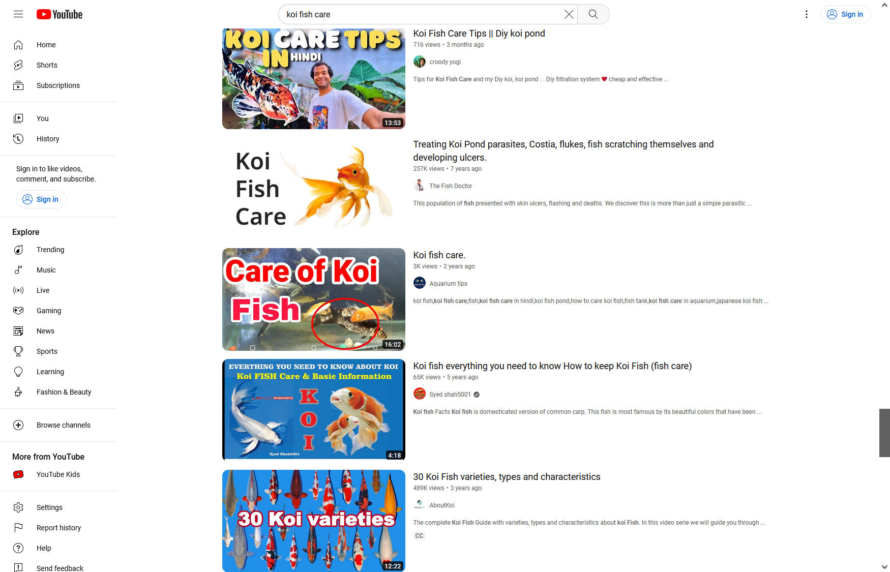
Authors tend to overwhelm their covers trying to stand out in competitive niches. If it's usually a good practice to declutter compositions to reduce noise, when the options around are exaggerated, it's one more reason to do it. And the clear message is the most impacting.

I replaced one of the thumbnails below with something simple, done in a couple of minutes, to show that it's possible to be effective without resorting to arrows, confetti, "according to science", "evidence-based", or other garbage.
-
@Amazoniac said in Resources for authors:
I gathered them little by little and the collection was available in a private group where I communicate with my gurus.
A pack rat if there is one. Thank you for sharing what you pack. You must do backups conscientiously. I frequently have the equivalent of a house fire destroy what I pack digitally over the years. Glad my mind doesn't crash, so far.
-
@Amazoniac said in Resources for authors:
@yerrag
The English is better now because of conscious effort to moderate the Prolactinese and keep the speech minimally understandable. However, I continue to reject most of the formalism in everyday writing, for treating it as a conversation and to not depersonalize it too much in trying to eliminate mannerisms. As an example, overuse of adverbs is condemned by writers, but I insist for that rebel quota. I don't bother with correctors for informal writing.Now I'm tempted to ask what you mean but I won't. Innuendos and double entendrés are styles to be mastered, both for rhe writer and the reader.
This article relates to the second part of your post. But being on the passenger's seat is different than being the driver, so I don't think that reading a lot will be much effective in improving writing skills, although it helps (enhancing vocabulary would be an example). In support of the need of practice, try to learn a new language by only receiving information and applying it once you reach a satisfactory level: it's likely that you'll struggle.
I beg to differ. Just as many naturally gifted musicians learn by oido, or street dancers learn by feel, one can learn to write by getting drunk or gorging in books. Though I can say I wish I were that.
-
@Amazoniac said in Resources for authors:
The English is better now because of conscious effort to moderate the Prolactinese and keep the speech minimally understandable.
Wow, that's interesting. Do you mean that the higher prolactin levels the more distorted the clarity of a speech may be?
(As prolactin is related to stress and anxiety)Can you tell us more about it?
-
@yerrag said in Resources for authors:
I beg to differ. Just as many naturally gifted musicians learn by oido, or street dancers learn by feel, one can learn to write by getting drunk or gorging in books. Though I can say I wish I were that.
If someone could watch as many music concerts or dance performances as he or she wanted and then had to pick an instrument and perform, I bet that the person would have difficulty.
@Kvirion said in Resources for authors:
@Amazoniac said in Resources for authors:
The English is better now because of conscious effort to moderate the Prolactinese and keep the speech minimally understandable.
Wow, that's interesting. Do you mean that the higher prolactin levels the more distorted the clarity of a speech may be?
(As prolactin is related to stress and anxiety)Can you tell us more about it?
Never mind, it's a joke that started on the Garrey Smeat Forum.
-
@Amazoniac said in Resources for authors:
Never mind, it's a joke that started on the Garrey Smeat Forum.
LOL! Nice one, thanks for the clarification

-
@Amazoniac said in Resources for authors:
If someone could watch as many music concerts or dance performances as he or she wanted and then had to pick an instrument and perform, I bet that the person would have difficulty.
But if that someone were gifted, he could. If someone went to art school and the best he could get is theory, he would just be performing in parochial churches, not cathedrals, much less concert halls.
-
Programmers may use code editors for general purposes and some people are fond of the basic notepad with the default font.
If your writing involves reflecting on what you just wrote, monospaced fonts can be an issue. However, the split screen with the goofy font for editing and a live preview with a readable font perhaps addresses this.
Learnability in Information Design
"Text can be presented in a monospaced font or a proportional font; extensive research has demonstrated that a proportional font is more readable than a monospaced font [4]."
User Interface Design For Programmers
"You may have noticed that almost every edit box on the Macintosh uses a fat, wide, bold font called Chicago which looks kind of ugly and distresses graphic designers to no end. Graphic designers (unlike UI designers) have been taught that thin, variable spaced fonts are more gracious, look better, and are easier to read. All this is true. But graphic designers learned their skills on paper, not on the screen. When you need to edit text, monospace has a major advantage over variable spaced fonts: it’s easier to see and select narrow letters like “l” and “i”. I learned this lesson after watching a sixty year old man in a usability test painfully trying to edit the name of his street, which was something like Fillmore Street. We were using 8 point Arial, so the edit box looked like this:"

"Notice that the I and the Ls are literally one pixel wide. The difference between a lower case I and a lower case L is literally one pixel. (Similarly, it is almost impossible to see the difference between “RN” and “M” in lower case, so this edit box might actually say Fillrnore.)"
"There are very few people who would notice if they mistyped Flilmore or Fiilmore or Fillrnore, and even if they did, they would have a heck of a time trying to use the mouse to select the offending letter and correct it. In fact, they would even have a hard time using the blinking cursor, which is two pixels wide, to select a single letter. Look how much easier it would have been if we had used a fat font (shown here with Courier Bold)"

"Fine, OK, so it takes up more space and doesn’t look as cool to your graphic designers. Deal with it! It’s much easier to use; it even feels better to use because as the user types, they get sharp, clear text, and it’s so much easier to edit."
From Monospace to Duospace: In Search of the ideal writing font

"In contrast to proportional fonts that communicate “this is almost done” monospace fonts suggest “this text is work in progress.” It is the more honest typographic choice for a text that is not ready to publish."
"The typographic rawness of a monospace font tells the writer: “This is not about how it looks, but what it says. Say what you mean and worry about the style later.” Proportional fonts suggest “This is as good as done” and stand in an intimidating contrast to a raw draft."
"Proportional fonts are optimized for high reading speed. That makes them the perfect choice for reading. Good writing, on the other hand, is measured, reflected, slow. It takes one step at a time. In a monospace font every letter, every number, every punctuation mark and every space takes the same visual space, which slows us down. And, for writing that’s a good thing."
"Proportional fonts save space. They suggest that you “hurry up and fill the page.” Monospaced fonts, on the other hand, feel more productive. Every typed letter translates into a homogenous visual progress in writing. It is both more relaxing to write at a slower pace and more satisfying as the progress is more tangible."
"Programmers use monospaced fonts for their indentation and because it allows them to spot typos. In a perfectly regular horizontal and vertical raster, letters and words become easily discernible: A typical proportional font comes with word spaces as wide as an i. Monospace fonts come with rather large word spaces. This makes it easier to discern each word and letter."
"Designers have pointed out that, with all the structural benefits that may or may not come from using a monospace font when writing, there are typographical compromises in typewriter fonts that are mere mechanical constraints that can and should be overcome. Due to the way mechanical typewriters worked, using the same horizontal space for each letter was inevitable at the time."
Making Code Beautiful With Type
Gain the Upper Hand with Good Typography
"Times New Roman was invented in the early 20th century for the Times of London and quickly gained traction among newspaper publishers. The Times commissioned it as an intentionally narrow font to fit more text per line and to enable quick reading.[6] Even from the beginning, it was criticized as unappealing to the eye."
"For all its ubiquity in self-published documents, when was the last time you saw Times New Roman in a book? Maybe never. Fonts used in professionally published books are comparably easier to read. This visual appeal, in turn, fosters comprehension and retention.[7]"
-
Great resources, Amazoniac. Facing numerous writing deadlines on tight deadline, the procrastinator in me of course dove right in!...followed by several hours spent "catching up" on (deep matters of erudition such as) the pros and cons of New Times Roman vs. other typeface/fonts

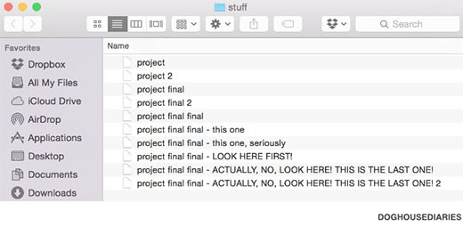
Like many who code and/or publish research for a living, I've always imagined that someone out there had figured out a better file-naming/file-management conventions that -- if only I could discover it -- might improve my productivity. Thus, coffee-spilling-in-lap LoLs from this graphic you posted, which I hope others will have enjoyed as much as I did:

-
Another topic that appeared in conversations with my pastors is how work that starts to get complex can bring hesitation in modifying it in further, for fear of losing parts by accident or messing up. Despite being possible to undo changes or resort to file history offered by some programs, it's more guaranteed to advance the work through duplicate files, relying on a copy of the latest version.
- If the modification goes well, the duplicate file is adopted and the original is kept as record.
- If the modification goes bad, the experimental copy is abandoned and you're left at where you were, with an intact material.
This makes experimentations riskless and must contribute to creativity.
ㅤ
Learning in double time: The effect of lecture video speed on immediate and delayed comprehension
"We presented participants with lecture videos at different speeds and tested immediate and delayed (1 week) comprehension. Results revealed minimal costs incurred by increasing video speed from 1x to 1.5x, or 2x speed, but performance declined beyond 2x speed. We also compared learning outcomes after watching videos once at 1x or twice at 2x speed. There was not an advantage to watching twice at 2x speed but if participants watched the video again at 2x speed immediately before the test, compared with watching once at 1x a week before the test, comprehension improved. Thus, increasing the speed of videos (up to 2x) may be an efficient strategy, especially if students use the time saved for additional studying or rewatching the videos, but learners should do this additional studying shortly before an exam. However, these trends may differ for videos with different speech rates, complexity or difficulty, and audiovisual overlap."
ㅤ
Examining Increasing Playback Speed in Recorded Lectures on Memory, Attention, and Experience"Recorded lectures represent a popular means of delivering educational content. These lectures afford increasing the playback speed which could be used to reduce time demands and increase the likelihood that a lecture is consumed. In two experiments (N = 320), we examined the impact of increasing the playback speed of lectures across a range of speeds on memory for the lecture material, mind wandering, and the learner’s experience of the lecture. For speeds up until 2x, findings revealed no significant differences in memory for the material, mind wandering, and learner’s subjective experience of the lecture, with the exception that “enjoyment of speed” decreased as speed increased. Beyond a speed of 2x, however, significant impairments in memory for the lecture material and decreases in liking toward both the video lecture and the speed were observed. Moreover, the increase in mind wandering with time on task often observed in recorded lectures was not modulated by lecture playback speed. These results reinforce extant results in the literature on the effects of increasing playback speed on memory for lecture material and add new insights in terms of this strategy’s influence on mind wandering and learner’s subjective experience of the lecture."
ㅤ
I'm not shure why lavalier microphones aren't favored over radio station ones. They work well, are cheap, give the person some mobility, don't clutter the view with an alien arm and nor make the video obsolete by the time that it's published.
Perhaps it helps to feel less vulnerable when there's an object between the speaker and the camera? If this is the case, increasing comfort may be a valid reason to keep it. Otherwise, the clean option seems better.
Member jwayne will help us in the comparison between lavalier and vintage mics:


-
List of cognitive biases | Wikipedia
How to enable extensions in Incognito mode | Brave
"Like other browsers mentioned above, Brave automatically disables extensions in Private browsing mode."
-
"This review article is devoted to the disfluency effect, which is observed as an improvement in the memorization of information and subsequent educational results due to reduced processing fluency. According to the basic explanation of the disfluency effect, if information is written illegibly, the learner senses complexity, or disfluency, which leads to a deeper processing of information. Traditionally, the disfluency effect is considered from the perspective of Bjork’s desirable difficulties approach and Sweller’s cognitive load theory. In this article, we pay attention to these concepts and also discuss the main studies and meta-analyses devoted to the effect. It is worth noting that the existence of the disfluency effect is not seen as indisputable and raises doubts among the authors of the review and other colleagues. As indicated, a significant number of studies do not detect the effect; for this reason, possible moderators influencing its manifestation are also considered. A separate section of the review is devoted to research of the Sans Forgetica font. The font was specially created to be disfluent, and its developers proceeded from the assumption that the disfluency effect really exists. This review article is addressed to a wide range of readers, and it may be of interest to both specialists in the field of metacognition and for pedagogical practitioners."
-
Dynamic Lights: Lighting Up Students' Minds | Euronews
You can find plenty of information on dynamic lighting and attention. Cycles of bright white light can be an useful tool to explore.
The stress of a cold shower may also be of help for alertness.

