Resources for authors
-
Below are links from private conversations that may help you authors tweak your workflows and deliver content with more clarity to your external audiences.
The topics are diverse and the approach is basic. The religion in them can be overlooked to extract what you find relevant. Conflicting information nearby can serve to offer different perspectives on a subject and you pick what suits you best. If you start to get too caught up in these aspects, reconsider if it's worth persisting because they're not essential to authoring valuable material.
However, details count in minimizing the effort that can go into making sense of the information, which applies to you in authoring and to your audience in processing the material. One of these details can be the difference between continuing and giving up earlier in demanding activities.
Your audience won't be in the same conditions as you. For example, you may prepare your material in a cozy environment when in a favorable mood, sipping tea, with two giant screens for the distribution of the content, but someone may arrive on this material under severe stress, exhausted, and reading it in captivity from a scratched phone.
Skim through the content and it's likely that you'll find at least something useful.
Text editors
In case you don't have a specific tool to organize your ideas already, any of the suggestions below should work well.
↳ Zettlr
↳ IA Writer (shines on simplicity and has cool features: syntax highlighter and style checker)
Distraction-free Writing | Vegard Skjefstad
↳ Calmly Writer Online (customizable; to be used on-the-go)

(although it can get messy with large files)-
Scrivener (some authors are fond of it and use it for everything, from journaling to writing articles and books)
-
Comparing Scrivener, Microsoft Word, and Obsidian | Danny Hatcher
-
I wrote an Entire Book with Free and Open-Source Software (LibreOffice) | Learn Linux
Worth the mention:
- ReSiN editors
- Why LaTeX? | Eitan Lees
- Writing software options - Word vs LaTeX. Which is right for you? | Chris Harig
Other authors prefer complete freedom:
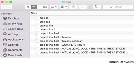
-
Layout-aware text extraction from full-text PDF of scientific articles
-
Okular (alternative to Acrobat Reader)
Writing (and grammar)
Yes, I'm not credible in this regard, but here we have some literates:
-
Writing in the Sciences | Kristin Sainani (highly recommended)
-
6 Story Outline Techniques for Writers | EM Welsh (for novelists, but relevant)
-
The Technical Writing Process: How to Produce steady high-quality content | Contentre
-
Judy Swan, Scientific Writing: Beyond Tips and Tricks | Public Communication for Researchers
-
Clear and Concise Technical Writing | Johns Hopkins Engineering for Professionals
-
User Experience Writing: Study Guide | NN Group
↳ How Chunking Helps Content Processing
↳ 7 Tips for Presenting Bulleted Lists in Digital Content
- Timeline for Writing a Research Paper in a Month | MIM Learnovate
- How to Write a Research Paper in a Month? | Sowndarya Somasundaram
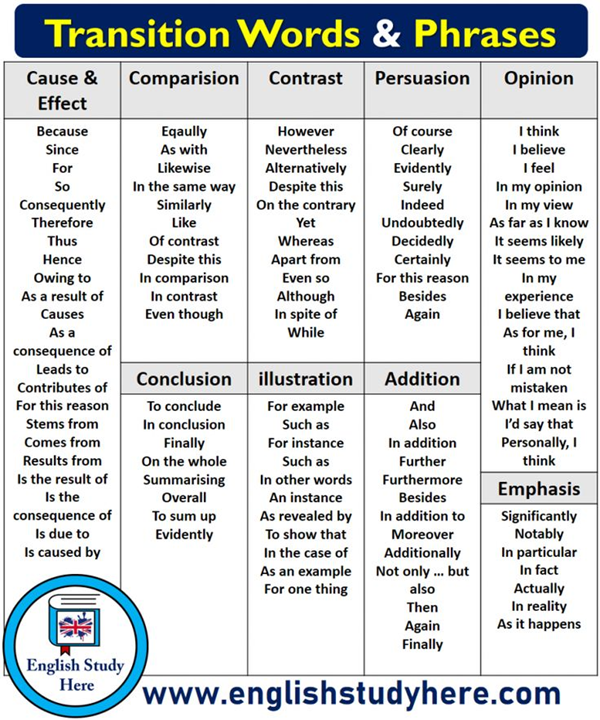
Refer to Kristin's course (above) to not overuse them.
-
Avoid Negative Words and Double Negatives to Strengthen Your Writing | Wordvice
-
When to Use a Semicolon vs Colon, Comma, and Em Dash (; : , —) | Wordvice
-
The Biggest Self-Publishing Mistakes and How to Avoid Them | Andrew Chapman
-
From Draft to Done: A Full Breakdown of the Writing Process | ProWritingAid
-
A Guide to the Writing Process: 6 Stages of Writing | MasterClass
To prevent any document that you publish from containing outdated contact information, it's possible to put your name next to a permanent link, directing to a profile that can be edited later with the recent information.
- Five Years of the ORCID Trust Program: Balancing Researcher Control and Data Quality
- What work types does ORCID support?
Derived from Mason Currey's Daily Rituals:
- The Daily Routines of Famous Creative People
- Creative Routines
- The Daily Routine of 20 Famous Writers | Mayo Oshin
- Daily Habits & Writing Routines of Famous Authors | ProWritingAid
- Maya Angelou’s “Just Write” Strategy
Writing is like any art or sport. Practice makes perfect. As we have seen, many authors argue that inspiration will only come if you push yourself to keep putting pen to paper each day.
The trick is not to overthink it. Write nonsense if you have to. But keep writing, no matter if you’re pleased with the final result or not.
Maya Angelou explained in the book Writers Dreaming:
“I suppose I do get ‘blocked’ sometimes but I don’t like to call it that. That seems to give it more power than I want it to have. What I try to do is write. I may write for two weeks ‘the cat sat on the mat, that is that, not a rat,’ you know. And it might be just the most boring and awful stuff. But I try. When I’m writing, I write. And then it’s as if the muse is convinced that I’m serious and says, ‘Okay. Okay. I’ll come.’”
- Anthony Trollope’s “Timed Writing” Strategy
Similar to Maya Angelou’s “just write” strategy is Anthony Trollope’s “timed writing” strategy. One of the most successful novelists of the Victorian era, Trollope figured out a daily writing routine that had him churning out books with astounding speed. Over the course of 35 years, he wrote 47 novels as well as many short stories, nonfiction books, and plays.
Even more impressive, he did all this while working a demanding job as a post office inspector. His job required him to travel often and keep a busy schedule.
That meant that when he sat down to write, he needed to make sure he met his daily word count goal.
In his autobiography, he described the strategy that he used:
It had at this time become my custom, — and it still is my custom, though of late I have become a little lenient to myself, — to write with my watch before me, and to require from myself 250 words every quarter of an hour.
I have found that the 250 words have been forthcoming as regularly as my watch went…
This division of time allowed me to produce over ten pages of an ordinary novel volume a day, and if kept up through ten months, would have given as its results three novels of three volumes each in the year.
Trollope’s timed writing strategy was so amazingly effective because he committed to turning off all distractions during that time period. He forced himself to concentrate on only the ticking of the stopwatch and his words.
- Neil Gaiman’s “Hibernation” Strategy
Sometimes strategies #1 and #2 don’t work. Maybe you’ve been working excitedly on your novel, but suddenly have absolutely no idea how the story should end. Or you’ve been writing a blog post, but can’t figure out how to write the conclusion.
Neil Gaiman offers this advice:
“Put it [your writing] aside for a few days, or longer, do other things, try not to think about it. Then sit down and read it (printouts are best I find, but that’s just me) as if you’ve never seen it before. Start at the beginning. Scribble on the manuscript as you go if you see anything you want to change. And often, when you get to the end you’ll be both enthusiastic about it and know what the next few words are. And you do it all one word at a time.”
- John Steinbeck’s “Write to One Person” Strategy
If a bad case of perfectionism is causing your writer’s block, you might find this strategy helpful. In a 1962 letter to his friend Robert Wallsten, John Steinbeck advised,
Forget your generalized audience. In the first place, the nameless, faceless audience will scare you to death and in the second place, unlike the theater, it doesn’t exist. In writing, your audience is one single reader. I have found that sometimes it helps to pick out one person — a real person you know, or an imagined person and write to that one.
Indeed, it’s exhausting and intimidating (and often downright paralysing) to try to write a story or a blog post that will please everybody. There will inevitably be someone who doesn’t like the fantasy genre or the thriller genre or whatever type of story you are writing.
Instead, when you write to a single person, it gives you a sense of purpose and direction and will help you get your creative juices flowing. I also find it motivating since I am now eager to share my completed work with that person.
- Ernest Hemingway’s “Hoarding” Strategy
If you’ve suffered from writer’s block but suddenly find all of that inspiration flooding into you again, don’t exhaust your resources! Always make sure to keep some inspiration in reserve.
Ernest Hemingway explained,
“The best way is always to stop when you are going good and when you know what will happen next. If you do that every day … you will never be stuck. Always stop while you are going good and don’t think about it or worry about it until you start to write the next day. That way your subconscious will work on it all the time. But if you think about it consciously or worry about it you will kill it and your brain will be tired before you start.”
Essentially, this strategy attempts to outmaneuver writer’s block. End your writing sessions mid-paragraph while you still have a clear idea of what you want to write next. That way you’ll maintain your momentum and avoid showing up to a blank page the next day with no idea how to move forward.
- Toni Morrison’s “Writing Ritual” Strategy
Toni Morrison and many other writers emphasize the importance of writing rituals, a set sequence of actions that you perform before you sit down to write. It could be as simple as making a cup of tea or playing one of your favorite music CDs. A ritual helps you mentally prepare yourself to start writing.
Toni Morrison observed,
Recently I was talking to a writer who described something she did whenever she moved to her writing table. I don’t remember exactly what the gesture was — there is something on her desk that she touches before she hits the computer keyboard — but we began to talk about little rituals that one goes through before beginning to write.
I, at first, thought I didn’t have a ritual, but then I remembered that I always get up and make a cup of coffee while it is still dark — it must be dark — and then I drink the coffee and watch the light come. And she said, Well, that’s a ritual. And I realized that for me this ritual comprises my preparation to enter a space that I can only call nonsecular…
I tell my students one of the most important things they need to know is when they are their best, creatively. They need to ask themselves, What does the ideal room look like? Is there music? Is there silence? Is there chaos outside or is there serenity outside? What do I need in order to release my imagination?”
- Hilary Mantel’s “Get Away From Your Desk” Strategy
If none of the previous strategies work, sometimes the best way to conquer writer’s block is to get away from your desk and clear your mind. Writer’s block often happens because your mind is overwhelmed by all of the thoughts about your daily life that are crowding your brain.
You need to create a space for your inspiration to fill.
Hilary Mantel offers this advice,
“If you get stuck, get away from your desk. Take a walk, take a bath, go to sleep, make a pie, draw, listen to music, meditate, exercise; whatever you do, don’t just stick there scowling at the problem. But don’t make telephone calls or go to a party; if you do, other people’s words will pour in where your lost words should be. Open a gap for them, create a space. Be patient.”
"Soon after Mark Foster formed Foster the People in 2009, he wrote and recorded "Pumped Up Kicks" in five hours while working as a commercial jingle writer at Mophonics in Los Angeles. On the day of recording, Foster debated between songwriting in the studio and going to the beach. He explained: "I really didn't have anything to do that day. I was standing there in the studio, and this thought came in my mind like, 'I'm going to write a song,'... and then I was like, 'I don't feel like writing. I don't want to write a song.' I was a block away from the beach, and it was a beautiful day. I kind of just wanted to just be lazy and go hang out at the beach or whatever. But I just forced myself to write a song... By that time the next day, the song was finished."
Reflecting on the lack of inspiration he felt when writing the song, Foster said, "I've heard a lot of other artists talk about this as well, like, 'I'm not inspired right now. I've got writer's block. I'm just not really feeling anything.' And I've felt that way, too, just not being inspired and wanting to wait for inspiration to come before I wrote. But I wasn't inspired when I wrote 'Pumped Up Kicks,' and that's what came out. So... it just solidified the notion that perspiration is more powerful than inspiration." Thinking that he was just recording a demo, he played all of the instruments on the song, and using the software Logic Pro, he arranged and edited the song himself. The demo is ultimately the version of the song that Foster released."
If you're curious to know the rigor that goes into writing a typical article of popular platforms, here it is:
Typography
Poor typographic choices result in early demotivation, make comprehension more difficult, and undermine reading endurance.
Short-form writers can get away with the neglect (when conscious, it had a purpose), but long-form writers should take them into consideration because of the cumulative effect. I have in mind those of you who write
articlestreatises (the 'reader mode' of browsers is unreliable) and ebooks.As a readers or writers, this section deserves extra care to not lead you to pay more attention to appearances than the message conveyed in texts.
- Summary of guidelines | Practical Typography (ignore what's pedantic)
- Type Scale (for reasoned hierarchy)
- Source Serif gets optical sizes | Adobe (excellent font family)
- IA Writer fonts
- Which Parts Determine the Impression of the Font?
- The dispute about sans serif versus serif fonts: An interaction between the variables of serif and stroke contrast
- The Legibility of Serif and Sans Serif Typefaces
- A matter of font type: The effect of serifs on the evaluation of scientific abstracts
- Serif or Sans: Visual Font Analytics on Book Covers and Online Advertisements
- Optimal Line Length in Reading — A Literature Review
- Calculating line length: an arithmetic approach
- Legibility of textbooks: a literature review
Users of Brave browser might remember how longer the lines of their Reader Mode were. They changed the maximum width of the text field ("width") from 800 to 590 pixels.
"65 characters (2.5 times the Roman alphabet) is often referred to as the perfect measure [for line length]. Derived from this number is the ideal range that all designers should strive for: 45 to 75 characters (including spaces and punctuation) per line for print. Many web designers (including me) apply that rule directly to the web. I’ve found, however, that we can reliably broaden the range to 45 to 85 characters (including spaces and punctuation) per line for web pages."
"To ensure line lengths don’t exceed 80 characters, the CSS max-width property can be set using font-relative lengths of around 70ch or 34em (note that this value will need to be adjusted slightly up or down depending on the font used)."
"On average one character takes up 0.5 em[.]"
The 'ch' unit is erratic, 'em' is more consistent between fonts.
- Line Spacing, Explained | Matt Samberg
- The influence of line spacing and text alignment on visual search of web pages
-
How reading in single- and multiple-column types influence our cognitive load: an EEG study
-
Striving for Modernity: Layout and Abstracts in the Biomedical Literature
-
Landscape Orientation for Online Newsletters | Michael Chusid (brief opinion)
-
Portrait vs. Landscape: Potential Users’ Preferences for Screen Orientation
"In 2008, the Web Accessibility Initiative, a group that works to produce guidelines for web developers, introduced a widely accepted ratio for creating easy-to-read webpages.
To translate contrast, it uses a numerical model. If the text and background of a website are the same color, the ratio is 1:1. For black text on white background (or vice versa), the ratio is 21:1. The Initiative set 4.5:1 as the minimum ratio for clear type, while recommending a contrast of at least 7:1, to aid readers with impaired vision. The recommendation was designed as a suggested minimum contrast to designate the boundaries of legibility. Still, designers tend to treat it as as a starting point."
It's better to seek what's optimal rather than sufficient. You'll probably arrive on a ratio close to 15:1 through experimentation, but it depends on the font in question and its size.
If you own a website, knowing the basics of HTML and CSS can make it easier to customize it outside of theme options.
Also worth checking:
If you must justify text, details for hyphenation to avoid weird gaps can be found here.
-
-
Presentations
The principles in this section are not limited to presentations, they apply to different formats.
- Designing PowerPoint Slides for a Scientific Presentation | CLIMBProgram
- Susan McConnell (Stanford): Designing effective scientific presentations | iBiology
- Academic Skills - Presenting Effectively | Service Commitment - University of Melbourne
- How to Give an Effective Scientific Presentation | Chuck Hages (UF)
- How to Design Research Presentation - Academic Presentation Tutorial | Scholarships
- Creating effective slides: Design, Construction, and Use in Science | CTLStanford
- Eric Heupel: Better Scientific Presentations, Design Tips | David Cline
- How to give scientific presentations | Evol Zool (DE)
- How to Give an Academic Presentation | David Taylor
- Preparation of a scientific presentation | K. Sundar
- Effective Scientific Presentation Workshop | LSU Health Post-Doctoral Association
- How to deliver a good scientific presentation | EULAR
- Scientific Presentation skills | WatECS
- The Craft of Scientific Presentations | Graduate Writing Center at Penn State
- Crafting Effective Academic Presentations | James Cook
- Academic Presentation Techniques: Good and Bad Example using MBTI
- Giving a Scientific Presentation - Hints and Tips | James Clark
- PowerPoint Tips for Teachers | Presentation Process
-
Am I Pretty? 10 Tips to Designing Visually Appealing Slideware Presentations
-
Evidence-Based Human Factors Guidelines for PowerPoint Presentations
-
Audience Perceptions of Fonts in Projected PowerPoint Text Slides
-
Enable a pen option in Adobe Reader full-screen mode | V-10 MathLover

No fancy equipment is needed:
- Khan Academy: Video in Education | 60 Minutes
- Sal's Tips for Creating Blackboard Videos for Remote Learning | Khan Academy Teachers


Narrated slides are quite informative. When done right, they don't remind people that they were prepared in presentation programs.
Abrupt transitions are unnatural and are one of the factors that remind the person of the dreaded slides. Smooth transitions of 1.5 second or so between changes help to address it: these are brief, but not rushed.
However, the effect is more useful than it seems. With smooth transitions, elements can be resized and rearranged, leaving it clear for watchers what's going on in the composition. Maybe it's an image that needs to magnified or pushed aside to make room for something else.
-
Keynote Tutorial: Create Pro-Level Video Animation with Magic Move | Michael Kinney
-
Creating advanced animations in Apple Keynote | Stephen Gates
It's easier to guide the viewer through gradual changes and animation. One of the most illustrative channels on YouTube uses something similar most of the time:
- Comparison of video hosting services | Wikipedia
- YouTube alternative sites and competitors | ExpressVPN
- YouTube Alternatives | Privacy Hub
Indicators of progress are tricky. Your audience is likely to be in front of their personal device with access to this kind of information somewhere on the screen; it's easy for them track if they want to, there's no need to put it in evidence. The tendency is to make it subtle:
It's difficult for these indicators to be used properly, where they motivate people to stick for longer waiting for what's next. Oftentimes it's another distraction to compete for attention, and the mere anticipation conflicts with processing the current information. If your audience is calculating the time to finish, something is probably wrong, as they already grasped the length before starting.
Something similar applies to sections. Moderate sectioning offers an overview, but in excess it tends to promote skipping.
Cameras
For the submissive appeal, it's common to spot women who want to provocate in livestreams placing cameras above their heads; not leveled, let alone below.
-
What you see is what you get: webcam placement influences perception and social coordination
-
A Facial-Action Imposter: How Head Tilt Influences Perceptions of Dominance From a Neutral Face
Graphics
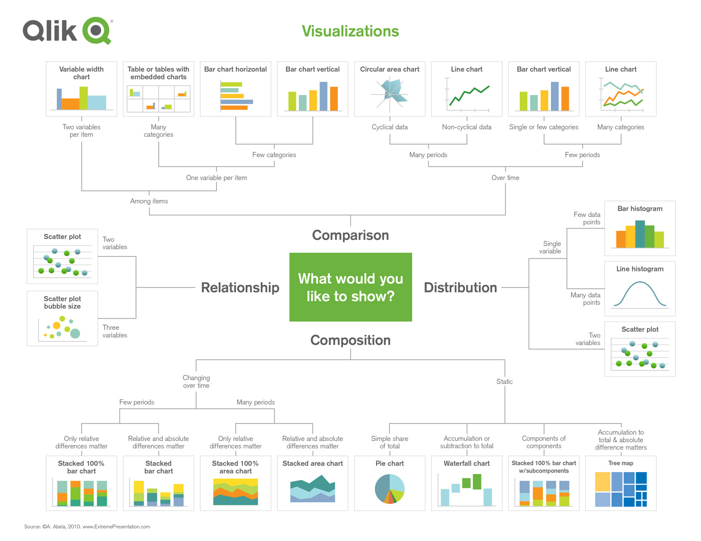
-
Designing for Broad Understanding of Science Insights from Practice
-
80 types of charts & graphs for data visualization (with examples) | Datylon
-
Information Graphics: A Comprehensive Illustrated Reference (978-0195135329)
-
Optimal use of color in data visualization | Towards Data Science
-
What to consider when choosing colors for data visualization | Data Wrapper
-
Why Tufte is Flat-Out Wrong about Pie Charts | Bruce Gabrielle
-
How to Use Gray Dashes Instead of Zeros in Tables | Depict Data Studio
To avoid random color coices:
- Free and Open-Source Diagramming Tools | Linux Ways
↳ Draw is a great app. It's available here as well.
- Creating Animated GIF Images | LibreOffice (applies to PowerPoint and Keynote)
To not dump images and conflict backgrounds:
- UI Design in Practice Series: Containers, Boxes and Borders | DesignerUp
- How to make better shadows in UI Design | UX Misfit
- 5 Types of Shadows for your UI Designs | DesignCourse
-
How to Create an Infographic - Part 4: How to Design Your Infographic
-
How to enhance clarity in your science figures | DiCarlo Lab UCLA
-
The Non-Designer's Design Book (0-321-19385-7)
Pricing
- Menu price endings that communicate value and quality
- Name-your-own-price as participative pricing strategy: a review of the literature from 2001–2017
- “I will pay you more, as long as you are transparent!”: An investigation of the pick-your-price participative pricing mechanism
Advanced search
- Google Search Operators | Moz
- Mastering Google Search Operators | Moz
- Google Search Operators | SEO Sherpa
Some of them work in Google Scholar (very helpful) and elsewhere:
Privacy
- Privacy Tools
- Privacy Guides
- Restore Privacy
- Techlore
- PRISM Break project
- ProPrivacy
- Awesome Privacy
- Terms of Service; Didn't Read
- The Hitchhiker's Guide to Online Anonymity
- The New Oil (is data)
- Browser Tests | Librewolf
- Test Sites | Arkenfox
↳ Privacy Tests - searchengine.party (via Privacy Tools)
- Disroot
- Brave Talk (to use with your
clientsvictims)
- Guide to Privacy-friendly Newsletters | Privacy Engineer
↳ Building a Privacy-first Newsletter | Katharine Jarmul - My Privacy Policy | The Opt-out Project
- Why this site isn't a Substack | The Opt-out Project
Web Analytics
Ergonomics
- Ergonomic Office: Calculate Chair & (Standing) Desk Height | BlitzResults
- Desk Height Calculator | Inch Calculator (for comparison)
- How To Set Up An Ergonomic Workstation: At Home Or The Office | Wellnessed
- How Tall Should Your Desk Be? | Juniper
"The industry standard height of office desks is 29 inches or 73 cm high for desks with a sitting design.
Regardless whether the desk is a standing or sitting desk, most office furniture is designed for people who are 6’ tall. Odd, since that’s not even the average height in the US!"
Timed work sessions
Many of you are autonomous workers that don't have supervisors, and some self-imposed structure can help to create habits. From the routines shared early on, note how disciplined and consistent those authors are.
Work sessions with prefixed intervals seem impractical when we consider that our state changes and a flexible approach that adapts to fluctuations appears more fitting. I used to think this way, but I've overlooked the discipline component and how our physiology also tends to adjust to challenges. The body becomes good at what it's conditioned to do and the capacity can increase when boundaries are pushed. So, focus sessions with specified intervals have their merit.
Some days we feel off, but a bit of persistence on the task sometimes is enough to overcome it. When it doesn't resolve, to maintain the habit, it's possible to switch to some activity that's less demanding, such as focusing on (re)organization and preparation rather than interpretation and composition.
There can be a pattern behind feeling off. Perhaps the meal before tasks that need concentration is too heavy or maybe your posture is defeatist. You can film yourself while working to spot some of these derailing factors.
Fatigue towards the end is expected, but the end can be reserved for lighter tasks, without changing the structured blocks.
When feasible, it's not a bad idea to experiment with splitting work sessions into two blocks: offline and online. If you can prepare the material in advance for the next day, it might allow you to have an early offline session with minimal external interference.
Exercise can have a residual effect for a period after it ends, helping to start sessions on the right foot and contribute to get into the state of 'flow'. If you feel stuck somewhere along the way, strategic pauses with movement can help, as we know it. However, a deity of mine is writing a book (a bible?) and we were discussing how authoring comes with conflicts and problems that need a solution. But until they're worked out, problems lead to tension, that can get physical, and it's better dissipated somehow to prevent its accumulation and spare concentration. It's not practical to get up on every discomfort, but it's possible to relieve the tension by doing some physical activity while working: walking at a low pace on a treadmill desk (speech-to-text if needed) or something simpler as bouncing your legs and chewing gum* when you notice signs of listlessness, until they pass.
When discipline and commitment are not an issue, you can try to hide every clock from your way, including the one on your desktop (that can be disabled), and set up an alarm to the end of your entire available window. The consequence is a temporary loss of sense of time, which contributes to immersive sessions, but without worries about missing future activities. Breaks in between are going to be intuitive.
*From our archive:
- Chewing gum selectively improves aspects of memory in healthy volunteers
- Chewing gum differentially affects aspects of attention in healthy subjects
- Effects of chewing in working memory processing
- Chewing gum can produce context-dependent effects upon memory
- Mastication for the mind—The relationship between mastication and cognition in ageing and dementia
- Chewing gum alleviates negative mood and reduces cortisol during acute laboratory psychological stress
- Effects of chewing on cognitive processing speed
- Chewing gum and context-dependent memory: The independent roles of chewing gum and mint flavour
- Effects of chewing gum on cognitive function, mood and physiology in stressed and non-stressed volunteers
- Chewing gum, stress and health
- Cognitive advantages of chewing gum. Now you see them, now you don't
- Effects of chewing gum on mood, learning, memory and performance of an intelligence test
- Chewing Gum Moderates Multi-Task Induced Shifts in Stress, Mood, and Alertness: A Re-Examination
- Chewing gum and cognitive performance: a case of a functional food with function but no food?
- Medicated chewing gum
Miscellanea
-
User interfaces in dark mode during daytime–improved productivity or just cool-looking?
-
Dark user interface, dark behavior? The effect of ‘dark mode’ on honesty
- My Noise (ambience)
- Silent Mice | Logitech (there are more models)
-
Thanks, tremendously helpful
-
I put all of my Ray Peat related stuff on Obsidian. Good thread.
-
It's money for nothing with you.
-
Wow, very helpful list. Much appreciated!
-
Thank you so very much!
-
Extremely useful compilation of resources. Thank you, @Amazoniac. Glad to see you back in full swing.
-
@Amazoniac If I'm not using pencil and paper, I write using the simple notepad that came installed on my android phone. Or sometimes a typewriter for artistic effect.
-
@jwayne
People usually lean forward to write: talk about being inclined versus disinclined. Assuming that you don't write on your ceiling, looking down must promote focus on the task, as it tends to isolate you from the surroundings. The head angle change might also have minor effects on circulation that can be significant over a long period, but I never stumbled upon any information on this. Perhaps spacecraft designers have considered this aspect because they have to decide what to prioritize on interfaces and the consequences of placing displays on relegated spots.
Might interest you:
- The Pen Is Mightier Than the Keyboard: Advantages of Longhand Over Laptop Note Taking
- Don’t Ditch the Laptop Just Yet: A Direct Replication of Mueller and Oppenheimer’s (2014) Study 1 Plus Mini Meta-Analyses Across Similar Studies
- Is typewriting more resources‑demanding than handwriting in undergraduate students?
- The effect of note-taking modality on offloading and memory under cognitive load
-
Two months of sustained routine to form a habit is the median time:
How are habits formed: Modelling habit formation in the real world
"
Table 2shows the values for the curve parameters for the 39 participants for whom the model was a good fit, andFigure 3shows examples of the modelled curves of their data. Ten of these participants were performing eating behaviours, 15 drinking behaviours and 13 exercise behaviours. The median time to reach 95% of asymptote was 66 days, with a range from 18 to 254 days."
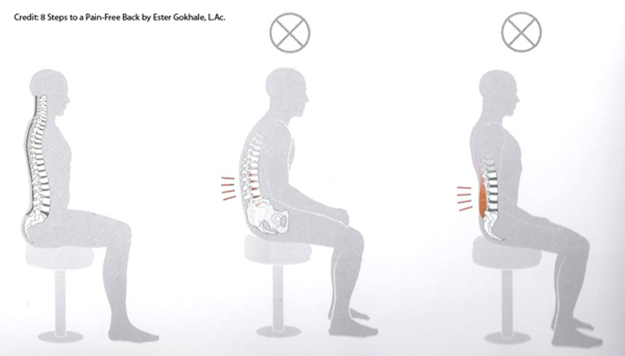
Racing chairs race you to the orthopedist:

For people who read a script while looking at the camera, an alternative would be to disappear from the scene to give space to supportive content on the screen, but appear at the beginning to greet and end to conclude if you want to keep it personal.
Narration may be viewed as a means to invite your victims next to you to show them your perspective rather than confronting them to defend your ideas.

-
This is a nice resource. I wonder how you got them all together @Amazoniac. Surely, you put a lot of time into this. Just looking at them is already overwhelming.
Are you using some of these tools yourself?
What I noticed with you as compared with the past at RPF is that your English is much more understandable now, as I had difficulty understanding you given that English is not your first language and you are Dutch, at least in citizenship if not by blood.
Then again, this is just me being curious and I hope you don't take offense. Or maybe you have a girlfriend now and you have plenty more practice with English. Just saying there are many ways to skin a cat lol.
Whatever your means to improve your English and getting across your ideas in English, it is working very well. I would not rule out you're getting some help from AI, if only to translate Dutch to English better.
But back to writing better, I was wondering if being a good author is something that can come naturally, just like learning a new language where being exposed to good English as in growing up without having to go thru the usual A as in Apple routine of kindergarten. Or even going thru the rigors of diagram analysis in learning sentence construction.
As learning from going to school has its downsides in possibly making the graduates cookie cutter in style.
If one reads a lot and has occasion to write, is it possible that he can develop by osmosis like a sponge from the books and novels of great authors. Like for example if one reads Ray Peat a lot, would one find his writing style becoming more like that of Ray Peat?
I think reading a lot can also do a lot of good in terms of being able to write well. What are your thoughts.
-
I gathered them little by little and the collection was available in a private group where I communicate with my gurus.
The English is better now because of conscious effort to moderate the Prolactinese and keep the speech minimally understandable. However, I continue to reject most of the formalism in everyday writing, for treating it as a conversation and to not depersonalize it too much in trying to eliminate mannerisms. As an example, overuse of adverbs is condemned by writers, but I insist for that rebel quota. I don't bother with correctors for informal writing.
This article relates to the second part of your post. But being on the passenger's seat is different than being the driver, so I don't think that reading a lot will be much effective in improving writing skills, although it helps (enhancing vocabulary would be an example). In support of the need of practice, try to learn a new language by only receiving information and applying it once you reach a satisfactory level: it's likely that you'll struggle.
-
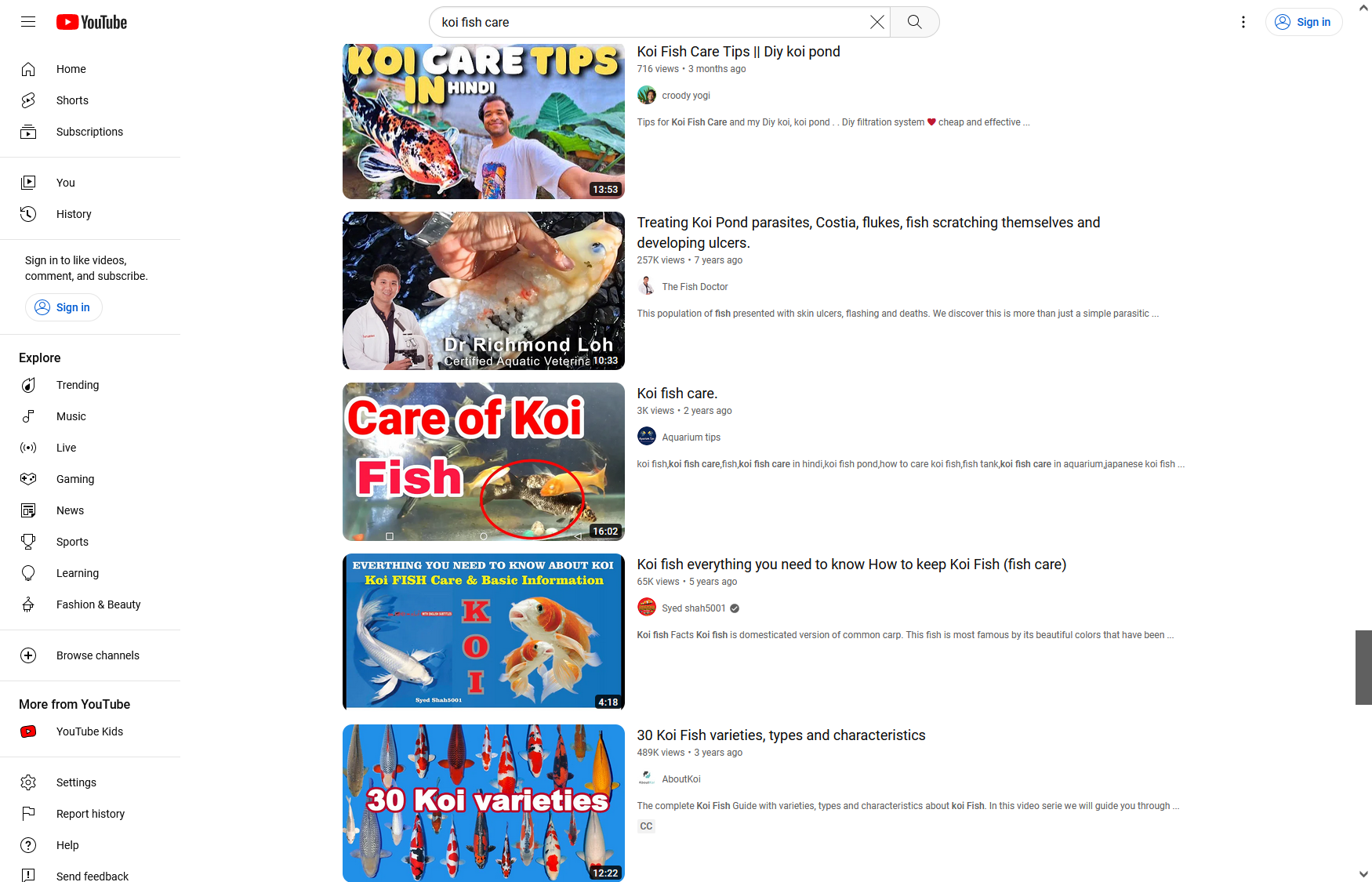
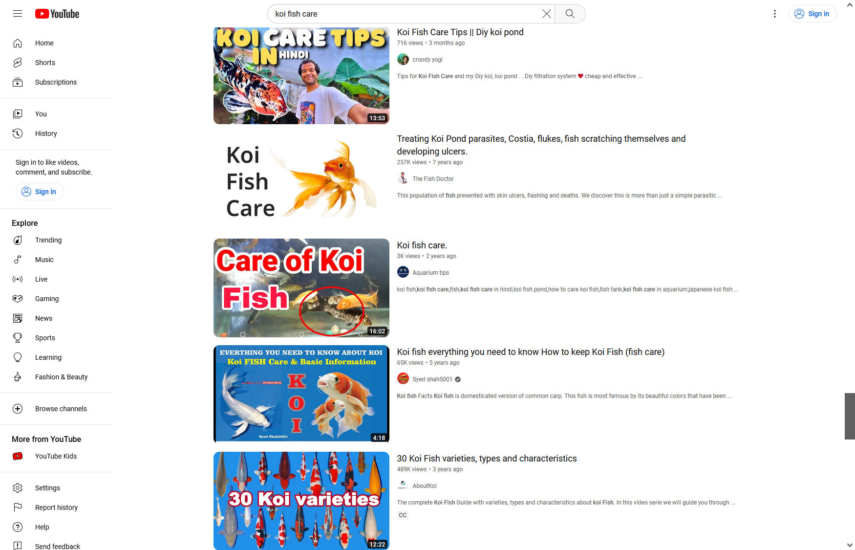
Authors tend to overwhelm their covers trying to stand out in competitive niches. If it's usually a good practice to declutter compositions to reduce noise, when the options around are exaggerated, it's one more reason to do it. And the clear message is the most impacting.

I replaced one of the thumbnails below with something simple, done in a couple of minutes, to show that it's possible to be effective without resorting to arrows, confetti, "according to science", "evidence-based", or other garbage.
-
@Amazoniac said in Resources for authors:
I gathered them little by little and the collection was available in a private group where I communicate with my gurus.
A pack rat if there is one. Thank you for sharing what you pack. You must do backups conscientiously. I frequently have the equivalent of a house fire destroy what I pack digitally over the years. Glad my mind doesn't crash, so far.
-
@Amazoniac said in Resources for authors:
@yerrag
The English is better now because of conscious effort to moderate the Prolactinese and keep the speech minimally understandable. However, I continue to reject most of the formalism in everyday writing, for treating it as a conversation and to not depersonalize it too much in trying to eliminate mannerisms. As an example, overuse of adverbs is condemned by writers, but I insist for that rebel quota. I don't bother with correctors for informal writing.Now I'm tempted to ask what you mean but I won't. Innuendos and double entendrés are styles to be mastered, both for rhe writer and the reader.
This article relates to the second part of your post. But being on the passenger's seat is different than being the driver, so I don't think that reading a lot will be much effective in improving writing skills, although it helps (enhancing vocabulary would be an example). In support of the need of practice, try to learn a new language by only receiving information and applying it once you reach a satisfactory level: it's likely that you'll struggle.
I beg to differ. Just as many naturally gifted musicians learn by oido, or street dancers learn by feel, one can learn to write by getting drunk or gorging in books. Though I can say I wish I were that.
-
@Amazoniac said in Resources for authors:
The English is better now because of conscious effort to moderate the Prolactinese and keep the speech minimally understandable.
Wow, that's interesting. Do you mean that the higher prolactin levels the more distorted the clarity of a speech may be?
(As prolactin is related to stress and anxiety)Can you tell us more about it?
-
@yerrag said in Resources for authors:
I beg to differ. Just as many naturally gifted musicians learn by oido, or street dancers learn by feel, one can learn to write by getting drunk or gorging in books. Though I can say I wish I were that.
If someone could watch as many music concerts or dance performances as he or she wanted and then had to pick an instrument and perform, I bet that the person would have difficulty.
@Kvirion said in Resources for authors:
@Amazoniac said in Resources for authors:
The English is better now because of conscious effort to moderate the Prolactinese and keep the speech minimally understandable.
Wow, that's interesting. Do you mean that the higher prolactin levels the more distorted the clarity of a speech may be?
(As prolactin is related to stress and anxiety)Can you tell us more about it?
Never mind, it's a joke that started on the Garrey Smeat Forum.
-
@Amazoniac said in Resources for authors:
Never mind, it's a joke that started on the Garrey Smeat Forum.
LOL! Nice one, thanks for the clarification

-
@Amazoniac said in Resources for authors:
If someone could watch as many music concerts or dance performances as he or she wanted and then had to pick an instrument and perform, I bet that the person would have difficulty.
But if that someone were gifted, he could. If someone went to art school and the best he could get is theory, he would just be performing in parochial churches, not cathedrals, much less concert halls.
