Dandruff or scalp irritation? Try BLOO.

    Bioenergetic Forum
    • Categories
    • Recent
    • Tags
    • Popular
    • Users
    • Groups
    • Register
    • Login

    Tweaks to the forum appearance?

    Meta
    12
    26
    1.2k
    Loading More Posts
    • Oldest to Newest
    • Newest to Oldest
    • Most Votes
    Reply
    • Reply as topic
    Log in to reply
    This topic has been deleted. Only users with topic management privileges can see it.
    • AmazoniacA
      Amazoniac
      last edited by

      A while ago I suggested changes to the standard theme of the forum, for a plainer appearance. Since some members keep manifesting interest in modifying it and Brad proposed the creation of a poll, I'm sharing variations of what was in mind back then.

      Current:

      dcc34b82-d678-44fc-b4f3-dd02e9ac118f-image.png

      Alternatives:

      128fcded-8cee-4076-b7c8-a3a642a9c6a4-image.png

      0f409c2c-074c-4561-8622-352155a18f0c-image.png

      It's difficult for admins to please everyone, but these modifications lean towards convention.

      I now have a support page!

      yerragY serotoninskepticS 2 Replies Last reply Reply Quote 0
      • yerragY
        yerrag @Amazoniac
        last edited by yerrag

        @Amazoniac

        It doesn't seem to make much of a difference.

        If the color palette used is the change, I am not swayed to move from the status quo.

        I am more stymied in not being able to post a screenshot or a picture much less paste a table, which I find it a no brainier to do at the old forum. Perhaps it is a matter of my ignorance with newer web and markup protocols, and I need time to catch up on these things. But the adage about old dogs and new tricks apply to me more these days.

        Temporal thinking is the faculty that’s
        engaged by an enriched environment, but it’s
        wrong to call it “thinking,” because it’s simply
        the way organisms exist... - Ray Peat Nov 2017 Newsletter

        AmazoniacA 1 Reply Last reply Reply Quote 0
        • SunnivaS
          Sunniva
          last edited by Sunniva

          The last example, if you are reading on your phone and zoom in to enlarge the text, takes less side to side movements to read.

          "You're changing your past every time you learn something because you become a different organism" Ray Peat

          "Everything is changing thru time, whether it's a word, organism, thing. The world around it changes, and so its relationships change"Ray Peat

          1 Reply Last reply Reply Quote 0
          • AmazoniacA
            Amazoniac @yerrag
            last edited by

            @yerrag

            If online media outlets are much invested in optimizing the experience of readers while trying to stand out in a competitive market, why is it so difficult to find one using a similar default pattern (orange tone with blue titles)?

            The current color gives it a drowsing appearance and adjusting this attribute to normal would already be a good tweak. The examples also include changes in font size, line length and space, italicized parts, and titles darkness. All are modifications that make a difference in repeated use and take minimal effort.

            It's nice of Brad to offer personalized themes, but it's not practical to have hundreds of variations for each individual preference. The preferences can be subjective, yet we can't go wrong resembling Kvothe's state before the reversal of his vasectomy: sterile.

            I never had issues uploading images. You can search for tools that convert Excel to Markdown tables, or go through a short tutorial to solve it in minutes.

            I now have a support page!

            yerragY 1 Reply Last reply Reply Quote 0
            • yerragY
              yerrag @Amazoniac
              last edited by

              @Amazoniac

              Probably the changes you propose is not so evident when my primary device is a 6" phone, where the changes you made such as going from sans serif to serif type can hardly be noticed. And the contrast and color difference while noticeable, is not dramatic enough, especially when the current layout scheme isn't gawdy to start with, and some people like me don't mind the soft feel of pastel.

              But if the objective is to keep up with the material design of Google and Apple, it may be said to be lagging but it certainly isn't so dated as to resemble the very dated Windows 95 look.

              For me, the design is not as important as the quality of content and the quality of discussions and the spirit in which we share and learn from each other.

              Perhaps if I were to use a tablet or a device with a larger screen, I would be more keen on tweaking the interface. It may be that most members here use their phone as well, over larger tablets and monitors. Heck, I hardly even use my TV anymore. Even the LCD projector I bought has been sitting in a corner.

              Thanks for sharing the tutorial. I'll get around to it else I lose my presentation skills.

              Temporal thinking is the faculty that’s
              engaged by an enriched environment, but it’s
              wrong to call it “thinking,” because it’s simply
              the way organisms exist... - Ray Peat Nov 2017 Newsletter

              AmazoniacA 1 Reply Last reply Reply Quote 0
              • serotoninskepticS
                serotoninskeptic @Amazoniac
                last edited by

                @Amazoniac Personally i like the current color. It reminds me of old book paper thats been yellowed over the years lol

                LucHL AmazoniacA 2 Replies Last reply Reply Quote 0
                • LucHL
                  LucH @serotoninskeptic
                  last edited by LucH

                  @Serotoninskeptic said in Tweaks to the forum appearance?:

                  Personally i like the current color. It reminds me of old book paper thats been yellowed over the years lol

                  I like it too: It's less aggressive for eyes. More relaxing.
                  The possibility to underline part of the text to highlight key elements would also be nice.
                  Too much heavy bold type is not user-friendly.

                  serotoninskepticS 1 Reply Last reply Reply Quote 0
                  • serotoninskepticS
                    serotoninskeptic @LucH
                    last edited by

                    @LucH Yea true

                    1 Reply Last reply Reply Quote 0
                    • AmazoniacA
                      Amazoniac @yerrag
                      last edited by

                      @yerrag

                      I agree that these aspects are secondary to content quality, but content quality is somewhat irrelevant to the discussion, and the post composer works independently from the result. The appearance for reading can be improved without interfering with that of writing.

                      These topics sound superficial, but I find interesting how details of a website affect its visitors. Since it's a health forum, with members possibly not functioning optimally, any tweak must count. They would be final adjustments relative to the early format. I'm reposting them here for Bradley to gauge preferences.

                      Regarding fonts, it's telling that avid book readers favor seriffed fonts almost unanimously, just as the majority of websites oriented towards literature (an everyday example would be Substack).

                      I now have a support page!

                      yerragY 1 Reply Last reply Reply Quote 0
                      • AmazoniacA
                        Amazoniac @serotoninskeptic
                        last edited by

                        @Serotoninskeptic

                        I think that the intention was to recreate the appearance of old paper. In this case, observe that the interior tends to be spared of degradation and the borders seem closer to Firefox's sepia than the artificial color in use:

                        c07725b6-d9cb-4553-bdc5-2016948cdda3-image.png

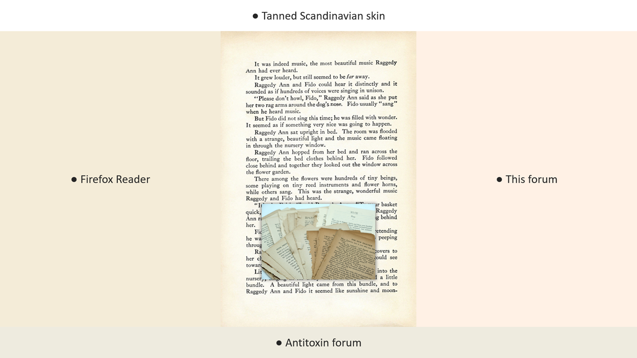
                        Not even book antiquaries adopt it:

                        • https://www.vialibri.net/
                        • https://www.abaa.org/

                        I now have a support page!

                        1 Reply Last reply Reply Quote 0
                        • yerragY
                          yerrag @Amazoniac
                          last edited by yerrag

                          @Amazoniac

                          Thanks for your effort at improving the style and appearance of the website. Any change done has to come from a conscious critique aimed at making the viewing experience best for members and visitors alike.

                          No doubt the serif fonts are better than sans serif fonts, so I would welcome that change.

                          I'm glad though that the site is already well designed to start with and that it started generally off the right foot. Gone are the frontier AOL days where ransom notes are the norm, and the use of boldface is commonly mingled with typewriter era habits of hurting the eye with underlines. Nor are rivers visible anymore where large loose spaces interrupt the flow of readability.

                          It is just much easier to design a website these days, for visually pleasing templates are available to save us from designing from scratch, and designing it is reduced to making judgment calls based mainly on taste preferences and small tweaks.

                          Like a few others here, I can say I like the soft hue of the pastel background as it is easy on the eyes, and as I write this, I can't help but state what I take for granted in its absence. There is less glare which is often what I see in a white background.

                          I have no qualms myself on the choice of blue that contrasts well with the beige background. There is good contrast that needs no tweaking to further enhance.

                          If someone's vision has an impairment that requires more contrast, modern devices give him the option of tweaking his display for much improvement contrast. There are many other ways to customize the display for a user's situational context. But I don't have to say more as this may just be staying the obvious and no insult is intended.

                          Temporal thinking is the faculty that’s
                          engaged by an enriched environment, but it’s
                          wrong to call it “thinking,” because it’s simply
                          the way organisms exist... - Ray Peat Nov 2017 Newsletter

                          1 Reply Last reply Reply Quote 0
                          • thyroidchor27T
                            thyroidchor27
                            last edited by

                            remove all the unnecessary subforums. Really drives down activty

                            1 Reply Last reply Reply Quote 0
                            • UncoverU
                              Uncover
                              last edited by

                              Could we not incorporate wallpaper on the sides like this:

                              JFF1ooRPR9.png

                              LucHL 1 Reply Last reply Reply Quote 0
                              • LucHL
                                LucH @Uncover
                                last edited by

                                @Uncover said in Tweaks to the forum appearance?:

                                Could we not incorporate wallpaper on the sides like this:

                                Beautiful but not advised. Why? => too long to load the page.

                                UncoverU 1 Reply Last reply Reply Quote 0
                                • UncoverU
                                  Uncover @LucH
                                  last edited by Uncover

                                  @LucH Good point I didnt think of that. Is this website builder we use slow? There are some ways to tweak picture to become lighter. I wounder if the pic would look to shitty. Maybe use backgrounds similar to danny roddy, they would still look nice even with some noise and size reduction over them. They could be really small pics in terms of size then.

                                  In my work I sometimes lower a 20 mb picture down to under 3 but it still looks ok especially if it has not to many different colours in original and if its a pic that doesnt need as much color fading etc to look nice. Also if noice and removal of some of the image structure dont ruin the picture. So a 6 mb picture could become really small so it should be possible

                                  LucHL 1 Reply Last reply Reply Quote 0
                                  • LucHL
                                    LucH @Uncover
                                    last edited by

                                    @Uncover said in Tweaks to the forum appearance?:

                                    Is this website builder we use slow?

                                    It's fine for me. 1or 2 seconds to load the main page.
                                    I have a medium speed connection: wired connection and 4 G (wifi) on PC.
                                    But many people surf with a mobile. Must be taken into account in some countries.
                                    A rough drawing might be suitable because very light in pixels. Mind with bright colors.
                                    Having a contest would be fine: share first ideas / propositions and then put 3 options to the vote.
                                    Keep in mind the end-purpose: light to load.

                                    UncoverU 1 Reply Last reply Reply Quote 0
                                    • UncoverU
                                      Uncover @LucH
                                      last edited by

                                      @LucH I wounder if this website builder can have wallpaper on pc and no wallpaper on mobile, that could be very good in this case

                                      Contest as in light in terms of filesize nice looking wallpapers? That could be cool

                                      LucHL 1 Reply Last reply Reply Quote 0
                                      • LucHL
                                        LucH @Uncover
                                        last edited by

                                        @Uncover said in Tweaks to the forum appearance?:

                                        I wounder if this website builder can have wallpaper on pc and no wallpaper on mobile

                                        Technically it's possible to have two different pages to be uploaded but it's a young forum. Wait and see 😉

                                        UncoverU 1 Reply Last reply Reply Quote 0
                                        • UncoverU
                                          Uncover @LucH
                                          last edited by

                                          @LucH What website builder is this?

                                          1 Reply Last reply Reply Quote 0
                                          • LukeL
                                            Luke
                                            last edited by

                                            I have noticed that search "in titles and posts" is now the default instead of "in titles". Definitely an improvement.

                                            I've never been a big party attender, but I never went to a party where I didn't probably offend most of the people there by talking about what I was interested in. (Ray Peat)

                                            1 Reply Last reply Reply Quote 1
                                            • 1
                                            • 2
                                            • 1 / 2
                                            • First post
                                              Last post